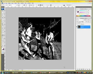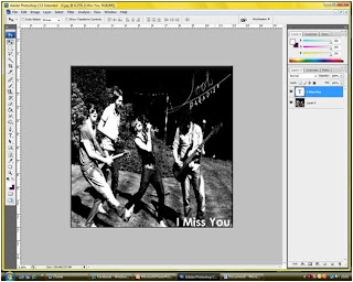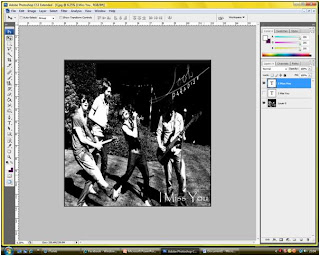
This is the photo once i added the logo that i decided to work with

I wasnt sure what font to use for the single name. It was a choice between the following two:


I decided to go with the first font. This is because it is bolder and more eye catchng which is what you need.
No comments:
Post a Comment